The Art of Color: How to Choose the Perfect Paint Palette for Your Luxury San Diego Home

Color isn’t just decoration—it’s atmosphere, emotion, and identity. In the world of luxury real estate, a well-chosen paint palette can transform a property from beautiful to unforgettable, enhancing both lifestyle and value. Whether you’re customizing a coastal retreat in La Jolla or preparing a modern masterpiece in Rancho Santa Fe, your color choices speak volumes.
But how do you choose a palette that feels curated, cohesive, and completely at home in your space?
Let’s explore the principles of selecting the right colors for each room, how to tie them together seamlessly, and why thoughtful color design is essential in today’s luxury real estate market.
_____
1. Start with the Setting: San Diego’s Light, Landscape & Lifestyle
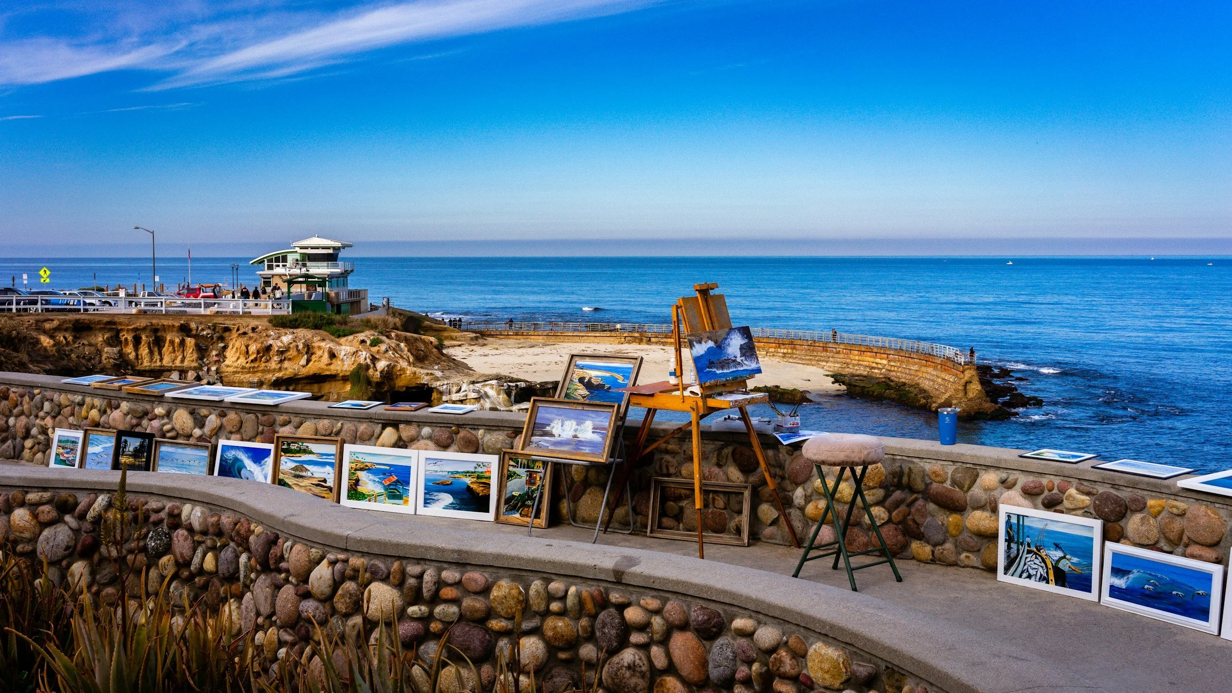
San Diego’s unique coastal climate offers abundant natural light, ocean-inspired hues, and indoor-outdoor living. Use these elements to your advantage when selecting colors:
Cooler tones like seafoam, soft gray, and misty blue complement coastal properties.
Warmer neutrals like sandy taupe, creamy beige, and sunwashed white work well with Spanish and Mediterranean architecture.
Bold contrasts—such as black-framed windows against white walls—highlight clean, modern architecture in Del Mar, Coronado, or La Jolla Shores.
Tip: Always test paint colors at different times of day. San Diego’s sun can make cool tones appear warmer and amplify brightness.
_____
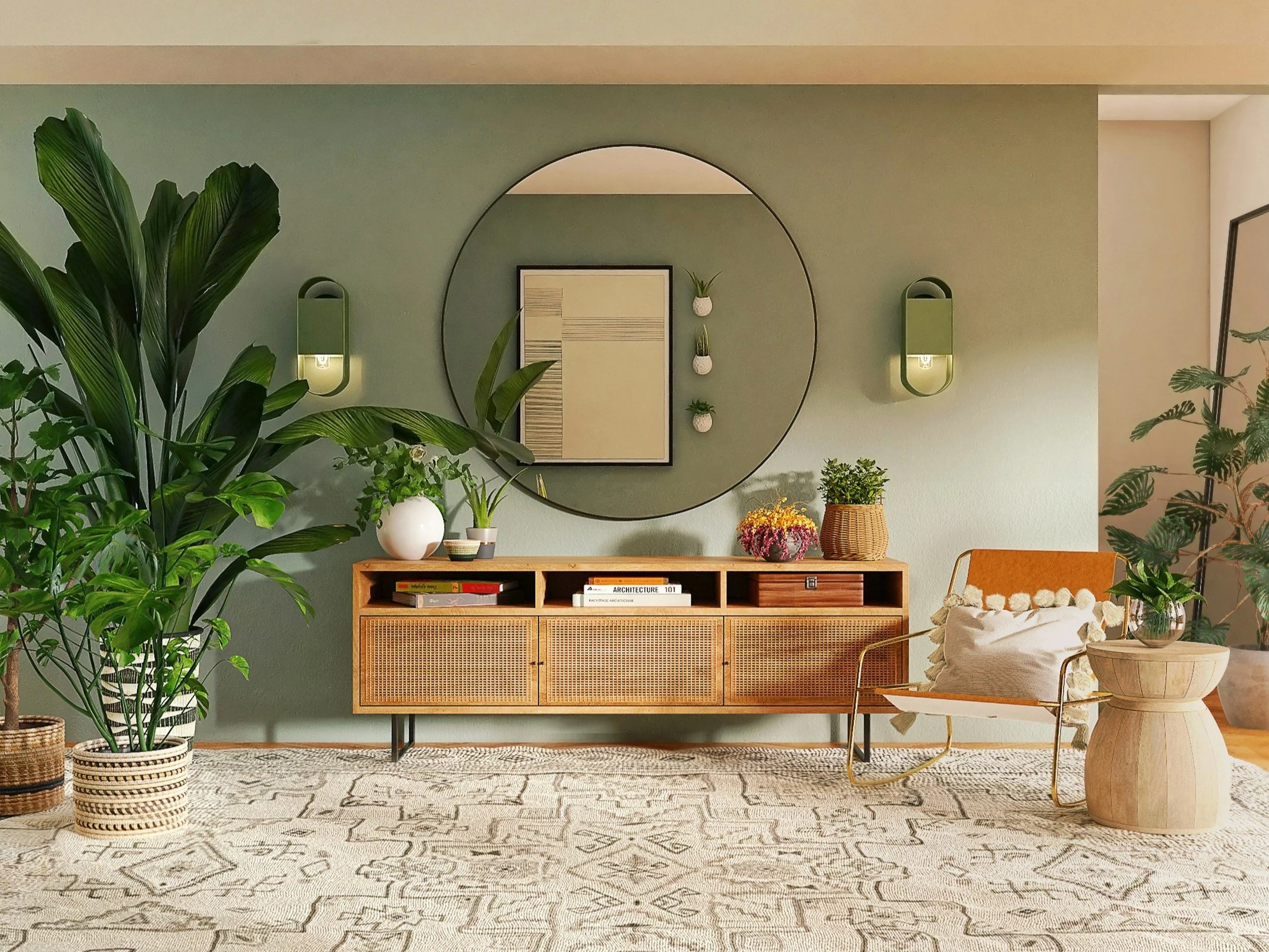
2. Create a Cohesive Flow: Room-to-Room Harmony
A luxury home should feel intentional and unified, not a patchwork of disconnected styles. Select a base color palette—usually 3 to 5 core colors—and apply them thoughtfully throughout the home:
Use a main neutral (e.g., warm white or soft gray) as your foundation across common areas.
Incorporate accent colors in furnishings, trim, or select walls.
Keep undertones consistent—cool vs. warm—to maintain visual flow.
Consider finishes too: Matte for ceilings, eggshell for walls, and satin or semi-gloss for trim and high-traffic areas create depth and sophistication.
_____
3. Tailor Your Palette to Each Room’s Function
Each space in your home serves a different purpose—and your color choices should reflect that.
Living Room
Choose warm neutrals or soft earth tones to create a welcoming, versatile space.
If your living room has a view, keep walls minimal to let the scenery shine.

Kitchen
Light, bright tones like creamy white or dove gray keep the kitchen feeling clean and open.
Deeper hues—navy, olive, or charcoal—can be used for an island or lower cabinetry to add contrast.
Dining Room
Rich colors like deep blue, moss green, or aubergine create a sense of intimacy and elegance.
Consider adding a statement wall in a high-gloss or textured finish.
Bedrooms
Soft, tranquil hues like dusty blue, muted sage, or blush promote rest and relaxation.
Master suites benefit from layered tones that feel both serene and luxurious.
Bathrooms
Light, spa-inspired palettes (think sea glass, alabaster, and pale gray) evoke calm.
Powder rooms are ideal for bold choices—try dramatic wallpaper, metallics, or moody jewel tones.
Home Office

Blue tones are associated with focus and productivity.
Earthy greens and neutrals can promote calm, grounded thinking.
_____
4. Don’t Forget the Fifth Wall: Ceilings & Trim
In high-end homes, details matter. Consider subtle ceiling contrasts like a hint of cream instead of stark white, or a high-gloss finish on crown molding to reflect light and elevate architectural details.
Trim and doors can be painted in a contrasting shade (charcoal, espresso, or a soft greige) for a more bespoke feel.
_____
5. The Psychology of Color in Luxury Spaces
Color affects mood and perception—especially in real estate. Use this to your advantage:
Cool tones make spaces feel larger, cleaner, and more modern.
Warm tones feel cozy, inviting, and timeless.
Dark, saturated colors add drama and intimacy—but use sparingly to avoid overwhelm.
White and light tones reflect light beautifully, making homes feel expansive and airy.
In luxury real estate, color isn’t just about what you like—it’s about how a space makes you feel. A well-designed palette should enhance architecture, highlight natural light, and express a lifestyle of refinement and ease.
_____
Final Thoughts: Color is Your Quietest Luxury
In the hands of a designer or discerning homeowner, color becomes more than a finishing touch—it becomes a defining feature of a luxury property. It tells a story. It sets a mood. And most importantly, it makes a house feel like a home.
Considering a repaint before listing or remodeling?
Our San Diego luxury real estate team can connect you with interior designers, color consultants, and professional painters who specialize in high-end residential properties. Let’s create a palette that reflects your style—and maximizes your home’s value.